-
2nd Edition of Data + Journalism This Fall!
You can pick up the second edition of “Data + Journalism: A Story-Driven Approach to Data Reporting” for your fall 2026 classes. Pre-orders start in late summer.
The new book features dozens of new tools, exercises and several new approaches with AI tools that the first edition didn’t have. The book serves as a great teaching tool or newsroom guide. It features dozens of training videos to walk you through the data storytelling process, and a new addendum that includes dozens of new international data portals.
-
Data Scraping Exercise Tweak
By Mike Reilley
If you are doing the data scraping exercise in Chapter 3, Page 52, exercise 1, here is a small tweak you need to make to the process. And you can thank the federal government.
In order to scrape all 600-plus failed banks from the FDIC failed banks list, you must first select “All” from the pulldown menu and then hit the “Apply” button to the left (see photo below). Once you have done that, you need to copy the new link and put that into the scraping formula.
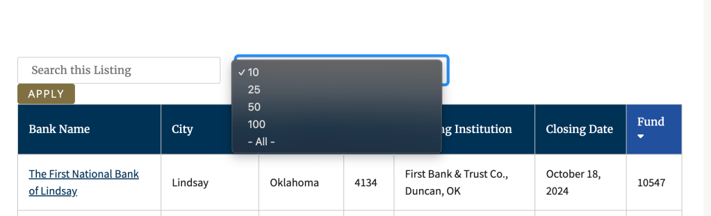
If you don’t do this step, you’ll get only the first 10 failed banks from the first page. Once you’ve hit the apply button, the new link will look like this: https://www.fdic.gov/bank-failures/failed-bank-list?combine=&items_per_page=All
And your formula should look like this:
=IMPORTHTML(“https://www.fdic.gov/bank-failures/failed-bank-list?combine=&items_per_page=All“,”table”,0)I’ve updated this on my data scraping handout.
Be on the lookout for more changes like this on government websites. They’re still scrapable, You just need this extra step.
Training video on the update
-
AI Tools for Data Journalists
By Mike Reilley
Since “Data + Journalism” published last December, dozens of new AI-driven tools and plug-ins have hit the market. We’ll be adding posts in the future about new tools, including Claude.ai and ChatGPT’s Code Interpreter, which looks to be a game-changer.
In the meantime, here’s a training exercise for ChatGPT’s Daigram plug-in, which lets you prompt an interactive chart by simply pasting data into it.
-
Bonus Chapter: Diversity, Equity and Inclusion in Data Reporting
By Samantha Sunne
As data collection, algorithms and social media become more and more influential in a reporter’s day-to-day life, journalists should grapple with a question: How can we incorporate data, and keep up with trends, while keeping diversity and inclusion in mind? How can we avoid leaving some groups behind, or emphasizing a status quo that leaves historically excluded communities at a disadvantage?
Diversity, equity and inclusion – sometimes abbreviated to DEI – has gotten more attention in the journalism community in recent years. Studies show that newsrooms in the US tend to be less diverse than the communities they represent and serve. Around the world, data journalists face similar issues, according to the 2017 News Nerd Survey by OpenNews.
So: How can we make our data journalism more diverse and inclusive, given these very real challenges? To start, Neema Roshania Patel, editor of The Washington Post’s Next Generation team, wrote a terrific set of five framing questions for a story for Poynter:- Are we including the voices of the people most affected by what’s happening?
- How are we defining “experts” in this story?
- Are we engaging with a diverse range of sources, even when the story isn’t explicitly about marginalized groups?
- Are we making assumptions about our readers?
- How are we explaining our process to sources?

The OpenNews News Nerd Survey These framing questions touch on many aspects of ethical journalism, such as building trust with readers, quoting diverse sources and identifying your audience. You can find excellent resources for some of these challenges from groups such as Trusting News or the Solutions Journalism Network. This bonus chapter will focus on achieving these goals through data reporting, via current guidance, tools, and tips from journalists who are putting these efforts into practice.
Don’t get trapped in old patterns
In September 2022, the Kansas City Defender, a multimedia Black news source, published an alarming story: A local pastor warned that women were disappearing from a Black neighborhood in Kansas City. Other local outlets, like the Kansas City Star and KMBC-9, ignored the claim – until, that is, the Kansas City Police Department (KCPD) put out a statement calling the claim a baseless rumor.
Using law enforcement data, such as 911 dispatches and police officer reports, is very common in data journalism – so much so that it is often what people are referring to when they say “crime data.” In this case, KCPD data backed up the department’s statement: very few people had gone missing recently in the city, and homicides were rare.
But controversy erupted weeks later, when a man was arrested in a nearby town. He had kidnapped at least one woman – possibly many more –from the very area the Defender had alleged.
By that point, outlets, including the Star and KCTV-5, had run stories like, “‘Completely Unfounded’: Rumor about serial killer in Kansas City is untrue, police say.” These stories relied mainly on police sources – both human and data – for their facts.
This occurrence is a perfect example of how official data can sometimes be misleading, instead of enlightening – and how this is especially likely and especially risky when marginalized people are at the center of the story.

Kansas City Defender TikTok video This particular case exemplifies several challenges that have been plaguing journalism for years:
- Over-reliance on law enforcement as a source, which is flawed and non-neutral
- Lack of historical engagement with the community at hand
- The privileging of data over people’s experiences and observations
Journalists strive to include all voices and be as accurate as possible. So what went wrong? Because the community in that neighborhood couldn’t rely on the police for appropriate help, they didn’t call in enough for disappearances to register in the dispatch data.
Not only did the official data fail to show the reality of a dangerous offender on the loose – it actively obscured it. This gap between the official data and reality on the ground took a dangerous situation and made it even more dangerous for the people living it.
So, as journalists, what can we do? One of the first steps is to keep framing goals in mind throughout all of your reporting. Gina Kaufman, who cataloged the Kansas City example for Nieman Reports, listed several suggestions including avoiding relying solely on police for sources. The challenges listed above –and Patel’s framing questions – are another good place to start.
This bonus chapter will also cover hands-on tactics to get you started on ethical, forward-thinking journalism.
Avoid conflating groups
Many data sources come to a reporter aggregated, meaning it has been compiled or averaged from several sources or subcategories. Aggregated data isn’t inherently bad; sometimes it’s actually more useful than granular data.
But it can have the side effect of hiding, erasing or conflating variables. Just as we saw with the gap between data and reality in Kansas City, aggregation is something that carries more risk when covering marginalized groups.
For example, if you open up the US Census, you will most likely see data aggregated by state. You may want to drill down for more specific info, but it doesn’t necessarily carry ethical risks.
On the other hand, aggregation of people, like ethnicities, can have additional consequences outside of data analysis. Abigail Echo-Hawk, a Pawnee journalist, pointed out that grouping American Indians together with White people can affect those people’s rights, laws and resources, which are all influenced by the number of American Indians counted in the Census.
“How does that benefit the larger population, to have us hidden within the data?” Echo-Hawk said on Twitter. “It effectively whitewashes the data, turns Native people into White people.”
But what can you do if the data is presented to you already aggregated?
Francisco Vara-Orta, DBEI Director at Investigative Reporters & Editors (IRE), recommends asking the source for the most specific dataset possible. Once you’ve got it, provide your audience with context and be clear about the data’s limits.
Accurate data “allows you to cut through rhetoric that really harms people and leads to cyclical problems that investigative journalists want to solve,” he said. “You have to realize skill building doesn’t stop with learning Python or R.”
Diverse datasets
In addition to keeping DEI in mind during your regular reporting, diversity itself can be the driver of a story. Data from around the world can shine a light on race, gender and other faultlines as the key piece of information to investigate.
These are a few datasets that might be helpful for finding equity-related stories. You can find other datasets in Chapter 2, Searching the Deep Web, in the Data + Journalism textbook.Humanitarian Data Exchange This is a hub of over 20,000 open-source datasets, mostly focusing on humanitarian topics like access to education, natural disasters and vaccine rates around the world. US Department of Education Civil Rights Data This enormous database of demographic info can be especially enlightening for newsworthy topics like school punishment, enrollment, and free and reduced lunch programs in US public schools. Our World in Data Cancer Survival Rates This is an example of a dataset from Our World in Data, an Oxford-run repository of data from around the world. The site allows you to overlay demographic info, like sex and race, to look for trends and make comparisons. Pew Research Center Gender & LBGTQ Research Topic The Pew Research Center is among the most trusted sources for opinion polling in the US. Here, you can find polls related to gender and sexuality, or navigate to other research topics like generation and politics. 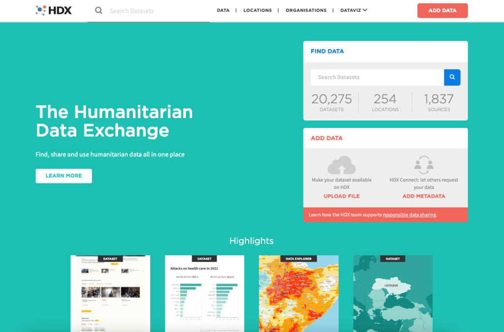
The Humanitarian Data Exchange Use up-to-date language
One of the best ways to incorporate DEI in your reporting is to use accurate and sensitive language. Word choice can have extremely large impact, including offending readers, making some people feel unheard, or even causing complete misunderstandings.
In a 2022 IRE Conference session, speakers recommended using as specific language as possible to identify sources, even if it costs word space. There can be exceptions for headlines, they said, but even for broadcast and radio, it’s more important for your audience to understand the source than to save a few words.
For example, in the 2020s US, “Republican,” “Conservative” and “Trump supporter” might mean completely different things, or all be synonymous, depending on who you ask. The reporters suggested using specific terms like “a Conservative-leaning Trump supporter” instead. This goes for data sources as well.
You might be unfamiliar with specific terms if you aren’t a member of the community, so you can use style guides from authoritative sources like the communities themselves.
Popular style guides
Here area a few style guides – lists of appropriate terms and phrases – that are especially popular in the journalism community:
Diversity Style Guide The Diversity Style Guide is a compilation of other style guides from groups like the NLGJA and SPJ. It’s not entirely comprehensive but offers a great one-stop shop for many common questions you might encounter, like whether to use the word “sex” or “gender.” Language, Please The news outlet Vox published this guide for all journalists who aim to “thoughtfully cover evolving social, cultural, and identity-related topics.” It offers very detailed background and guidance on specific terms and is updated regularly. Associated Press Stylebook The heavyweight in the journalism industry has added timely instruction on sensitive topics like ethnicity, gender and political terms. It is mostly available as a paid resource but offers parts of the guide for free. NABJ Style Guide The National Association of Black Journalists (NABJ) maintains a style guide for issues pertaining to the Black diaspora (people of Black and African descent around the world). AAJA Style Guide The Asian American Journalists Association released a new, updated style guide that covers descriptors, abbreviations, avoiding stereotypes and more. NAHJ Cultural Competence Handbook The National Association of Hispanic Journalists published a detailed guide to terms related to Hispanic and Latino people, including reporting and framing suggestions. Reporting and Indigenous Terminology The Indigenous Journalists Association (IJA) offers guidance on when and how to use terms like “Native,” “Indigenous” and “American Indian.” NLGJA Stylebook The Association of LGBTQ+ Journalists (NLGJA) provides a stylebook on terms related to sex, gender, sexuality and identity. Religion Stylebook This guide from the Religion News Association (RNA) offers a large amount of expertise in a small amount of space – for instance, when to capitalize “Catholic” or what is celebrated during Diwali. Realistically, there is no need to try to memorize all of this guidance or read a stylebook from cover to cover. They are meant to be kept handy as a reference.
You can also sometimes find specific guidance for communities like First Nations people in Canada, conflict survivors in West Africa, or Uyghur speakers in China. It’s always better to be more accurate than more broad. AAJA includes specific guidance for covering Pacific Islanders.
If you can’t find a guide that’s made by – or even for – journalists, you might find one from a government agency or advocacy group. For example, the New Zealand Ministry of Business offers guide to a words and icons in the Maori culture for trademarking purposes. If you’re using a non-journalism guide, you can assess the source for credibility and neutrality the same way you would any other (see Chapter 2 in Data + Journalism for more on vetting sources).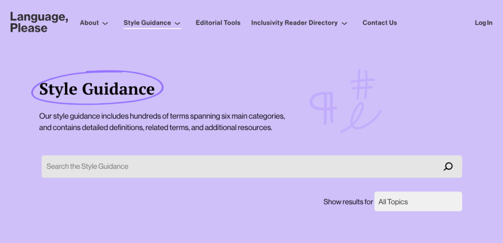
The Vox Language, Please guide If you’re ever not sure of a word, spelling or identifier, it’s best to defer to the source themselves.
“When covering the LGBTQ community, we encourage you to use the language and terminology your subjects use,” the NLGJA wrote. “They are the best source for how they would like to be identified.”
Capitalizing Ethnicities
Why is the ethnicity “Black” sometimes capitalized, while others, like “White,” are not? This is an example of how style can change over the years.
As of 2020, both the AP and NABJ encourage capitalization. A capital “Black” differentiates the word as an identifier of a group of people, rather than a mere adjective, such as in “black bird.”
Their guidance differs in that NABJ capitalizes other ethnicities, like “White,” while the AP does not. (This chapter uses NABJ style.) The AP noted that White people tend to have fewer shared experiences, and there was less global consensus around the world for who is grouped together as “White.”
If you are unsure of a term, or if you want to understand the reasoning behind it, it’s probably best to consult the community in question. The SPJ Race and Gender Hotline would be a good resource for questions like this.
Feature diverse sources
The diversity of a story’s human sources is another factor that has always been important, but is recently receiving more attention in the journalism industry.
In a basic sense, it’s important to have a diverse collection of sources in order to provide a balance of voices, experiences and perspectives in your story. It also helps your story avoid bias or one-sidedness. This is probably something you learned in your first journalism class.
From a DEI perspective, it’s also important to include a diverse array of sources to overcome the existing disparity in sourcing. In 2018, National Public Radio (NPR) found that an overwhelming majority of their sources were White and male, despite the outlet covering the entire US. Other outlets have published similar internal accountings.
Creating a more diverse body of work is something journalists have been working on for a long time, and every story helps. As Patel noted in her guide for Poynter, your story should utilize diverse sources regardless of whether diversity itself is the focus.
NPR’s Diverse Sources Database Diverse source databases
NPR Diverse Source Database NPR maintains a database of diverse sources on everything from sports to human rights. The site filters by state and topic, and even spotlights a source of the week. Diverse Sources This simply-named database lists nearly 1,000 experts across many science and academia-related fields. You can filter by expertise, language, time zone and other factors. Editors of Color Diverse Databases Editors of Color is a database of diverse media practitioners. It also offers a compilation of other databases, each with diverse experts in tech, politics, filmmaking and other industries. Journalist’s Toolbox: Finding Diverse Expert Sources This video shares several different resources for finding expert sources, as well as other tools from the Journalist’s Toolbox, a resource by SPJ. Source diversity audits
A specific technique for assessing story diversity is a tool called a “source diversity audit.” This is a survey or data collection you perform yourself, whereby you find out the diversity of the sources you are using or have quoted in the past.
You can use a specific tool, like this one from Chalkbeat and the Reynolds Journalism Institute (RJI), or simply create a survey on your own.
The Open Notebook wrote a guide on creating one of these surveys, and offers a template questionnaire you can use in Google Forms.
RJI put together a well-researched list of terms to use for categories like race and ethnicity, in order to be as inclusive as possible.
The Open Notebook sample source-tracking survey script Source Matters is another tool created by the American Press Institute (API). It offers automatic source detection and identification using natural language processing, and also includes expertise from the team of developers at API. Currently, Source Matters is available for a fee, and newsrooms can request to take part through its website.
Keep asking questions
This chapter has covered several challenges that may seem insurmountable to the average student or journalist. How can we enact these changes while producing daily stories and timely coverage? What can we do if sources don’t want to answer our diversity audit, or don’t have accurate data?
The answer is to be realistic about your goals and fall back to a central facet of journalism: Asking questions. For example, if a government agency doesn’t offer parsed-out data on its employees’ ethnicities, why not? Is the data collected? Is it private? Why or why not?
Vara-Orta suggested journalists ask these questions habitually, as a way of both soliciting interesting information and pushing for more equitable and accurate information for the public to use.
“That can sound activist, but really it’s just to serve everyone better,” he said. “Those are accountability questions, they’re not activism.”
Better data is better for reporters, which in turn benefits the public at large: the ultimate goal of journalism.
More DEI Tools
Here are some tools you can use to assess your own work as well as plan for more inclusion in the future.
SPJ Race and Gender Hotline This tool from the Society of Professional Journalists (SPJ) offers experts on demand who can answer questions on sensitive topics. They are paid for their time by SPJ, to avoid placing the workload on other journalists of color. Language, Please Inclusivity Reader Directory An inclusivity reader is someone with knowledge of a sensitive topic at hand – like gender, ethnicity or history – who can proofread an article for sensitivity to marginalized groups. Humaans Visuals are another good way to include diversity and avoid stereotypes (see Chapter 10 for more on these topics in data visualization). If you don’t have something topical like a news photo or infographic, Humaans is a fun tool for creating royalty-free illustrations with a variety of skin tones, body types and backgrounds. Proporti.onl Proporti.onl is a small, independently developed tool that estimates the gender diversity of your Twitter feed. It is not comprehensive and shouldn’t be used for something official like a story – but it can be an interesting insight into the media you are ingesting. -
Data + Journalism: A Story-Driven Approach to Learning Data Journalism
Reporting data-driven stories means following a process. Data + Journalism takes you from A to Z, from acquiring data to scraping, cleaning, analyzing, writing and visualizing data.
The book also addresses how to share data and build public trust with data, as well as interviews with top data journalists, training videos and hands-on exercises to elevate your data storytelling.
Newsrooms also can benefit from the book. Early and mid-career professionals looking to expand their skills will find the chapters easy to digest and the hands-on exercises practical and applicable to topics journalists cover today.
By fall 2022, the order form will be linked off this page. In the meantime, be sure to follow Mike and Samantha on Twitter for any announcements about the book.
Or email Mike if you want to be added to a mailing list and have the order form sent to you.
Mike: mikereilley1@gmail.com | @journtoolbox
Samantha: samanthasunne@gmail.com | @samanthasunne
-
Pro Tips: Creating Data Visualizations
Tips from Andy Boyle, data visualization consultant, Chicago Sun-Times

● Remember your audience. Put yourself in the shoes of someone who has no knowledge of this subject. What terms do you need to explain? What can you get rid of that might confuse them? If possible, share your project with others to get their initial thoughts, and don’t try to defend your choices, just listen to what they have to say. If you hear the same issue multiple times from different people, they’re probably right. Fix it.
● Data is political. Humans made choices about every data set you’ll ever come across. These are designed objects, which means some data is left out, some data is included that may be worthless, some data may be pulled in such a way that makes it worthless. You need to examine the creation of the data set and who made these choices before making your own decisions on how to display the data.
● Simpler is better. Complex graphics and charts are often made to make the creators feel awesome. That’s not your job. Your job is to communicate information effectively to your audience. Sometimes the best way to display data is through a simple table with numbers. Sometimes it’s through a paragraph of text. Other times it’s through a simple video.
-
Read More: Chapter 11 – Twitter Threads as Transparency
In chapter 11 of Data + Journalism, we explore ethics and transparency in data storytelling. One of the ways in which journalists can do this is to take their data diary — a live doc of steps they followed to produce the story and visualizations — and turn it into a Twitter thread.
Twitter threads are a series of tweets grouped together by a lead tweet — typically an overview with the link to the project — followed by a series of sub-tweets that provide details about the project.
Think of the subtweets as replies to the main post. They provide depth to the story and give your audience insight into how it was produced. You can mention reporting methods, issues you overcame, link to datasets and software you used, etc. Most threads are 10 to 20 tweets long.
It also gives readers a chance to reply and ask questions about the process, and, of course, retweet and share the posts.
Below is a series of Twitter threads used in data visualization and fact-checking projects by various media outlets. Click on “Read the Full Conversation on Twitter” or click on the headline to launch the full thread.
Jodi Cohen: ProPublica Illinois, UIC and FOIA Law
ProPublica: Migrant Children
Brought back an investigative piece on migrant children being separated from their parents after ICE began its detention areas in Texas in June. Shows depth and note how they broke down each tweet by person/issue. It really “put a face” on the story, rather than just sharing a bunch of statistics.BBC Africa: Anatomy of a Killing
This thread combines fact-checking techniques with visualizations using Google Earth tools to geolocate and verify the location of a gruesome murder of women and children in Cameroon. The BBC then used the Twitter thread to explain the process of how they proved the Cameroon government was lying to cover up the military’s involvement.
Sarah Smith: Fact-Checking Ben Carson on Houston Housing
The Houston Chronicle’s housing reporter used data and fact-checking skills to correct U.S. Secretary of Housing and Urban Development Ben Carson in this Twitter thread.Student Projects
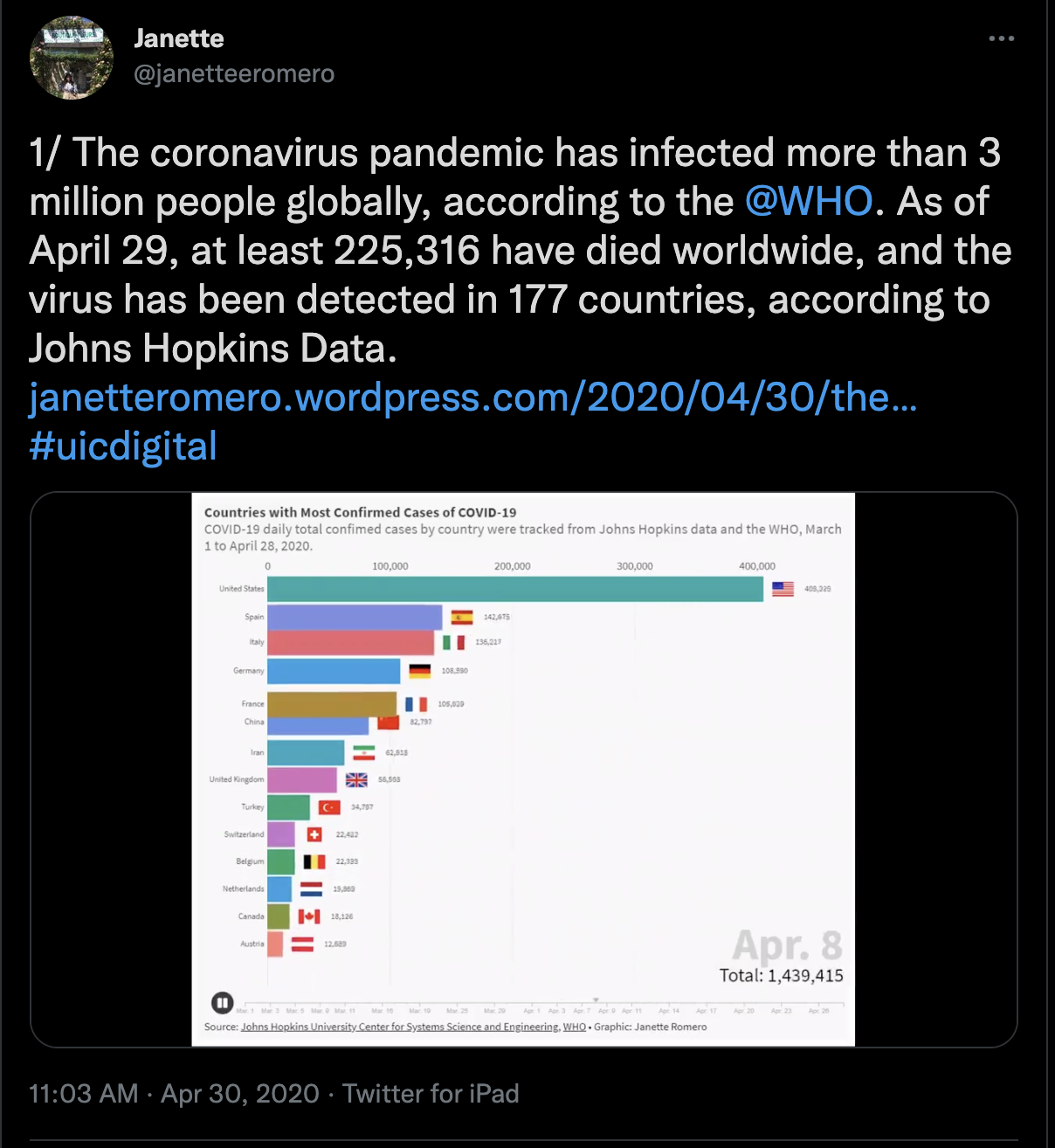
In the early days of the COVID-19 pandemic, student reporters for The Red Line Project at the University of Illinois-Chicago built several visualizations from datasets both global and local. They kept data diaries as they downloaded, cleaned and analyzed the data. They logged background on how they visualized the data and how it fit contextually into the story.They turned their diaries into Twitter threads, such as this one by then-senior Janette Romero. (Fig. 1)
Fig. 1
Romero posted a thread of eight tweets, with the first one featuring a link to her story and an animation showing COVID-19 positive cases by country through the first three months of the pandemic. Her threaded posts featured other charts her team built, their reporting methods and where they found the data.UIC senior Chris Katsaros and his team used a Twitter thread to explain reporting on Illinois COVID-19 cases. Senior Charles Tharpe used a Twitter thread to highlight key points in his team’s story on COVID-19 and the increase in domestic violence during the pandemic’s first few months.
Visualizations on Social Media
Journalists often use text cards – graphics that focus on single stat or quote – to feature on Twitter posts teasing a story. These text cards can be easily built with tools such as Canva (desktop and app), Adobe Post or Photoshop (desktop and app), Over (app) and other tools. They also can be built as animated GIFs with Google Data GIF Maker and other tools. These tools are handy for breaking stories – election night analysis, highlighting a stat or quote from a study, budget figures, crime statistics and more.
Some journalists pull graphics from their stories and attach them to tweets and provide a link to the story. The graphics grab readers’ attention as they scroll through Facebook or Twitter. Canva can be used to make text cards for Instagram stories. Apps such as Chartistic and Icongraph help journalists build charts on a phone or tablet that can easily be shared to social channels.
-
Exercise: Learn to Build Graphics by Playing with Legos
Before opening any design software, here’s a creative way for you to learn how to build a graphic.

Matt Waite, a professor of practice at the University of Nebraska-Lincoln, was searching for a way in 2015 to get his students to understand form, function and scaling a graphic. He reached back to his childhood for the answer – Legos.
Waite had his students create bar charts using a set of Lego blocks to illustrate Super Bowl statistics. Students had to grapple with scale: what did each block size represent: 10 yards? 20? 100?
Students worked in teams to scale the bar charts. Sticky notes can serve as labels and other “scaffolding” that Cairo refers to. The exercise is an effective way to help students understand design concepts before ever touching software.
“The Legos let them focus on representing the data with shape,” Waite told The American Journalism Review. “There wasn’t any, ‘Did I miss a semicolon? Did I use the wrong function? Did I press the wrong button?’”
In the past several years, professors from many other universities have experimented with using Legos. It works with many datasets – homicides, COVID-19, sports, etc.
-
Subscribe
Subscribed
Already have a WordPress.com account? Log in now.
